
Is Your Fort Lauderdale Website Design Mobile Friendly?
When Google unveiled the update of its search engine algorithms in the year 2015, a new word was gifted to the English dictionary. Yes, its ‘Mobilegeddon’, a name lovingly created by web developers to denote the changes evoked by this update. The main objective of Google’s update is to enable more mobile-friendly viewing of websites across different types of smartphones and tablets. This ensures that web pages load faster and that images and videos are also quicker to load on mobile devices.
This is a reflection of the growing use of smartphones and other mobile devices as the primary mode for browsing and searching the internet. By incorporating these updated algorithms in your website, or that of your client’s, you are ensuring that your website is more responsive to visitors of your website who are searching or browsing on their smartphones. With Google announcing a Mobilegeddon v2 coming soon, it is time to ask yourself if your Fort Lauderdale website design is ready for this latest update.
How Mobile Savvy is Your Company’s Fort Lauderdale Website Design
Although there are countless updates released every year, the reason this update was named ‘Mobilegeddon’ was because it was a major update that caused many websites that were previously performing very well on mobile search rankings to fall perilously low after the update (without it affecting the desktop search engine rankings though).
 Mobilegeddon v2 is being released in May 2016 and is anticipated with both dread and curiosity by web developers the world over. This version is only going to be an extension of last year’s update, with more requirements for websites to be mobile friendly. Google has released a statement stating that though it is important that websites be ready for the update and be strongly mobile friendly, the main criteria for ranking high in search engine results is still great content that is relevant and interesting. So that is one less thing to worry about if you are sure that your website features content that will keep people coming back for more!
However, it is still important to ensure that your mobile search engine rankings are not affected. This is because the competition in the field of online business is getting hotter with time. Also, the primary device that millions of people use for accessing the internet all over the world is their smartphone or tablet or any other mobile device. So even if your website is optimized for desktop searches, it is still smart to get it optimized for mobile searches too as this is where your target audience will be looking for the product or service that you have to offer. This is where you will be able to connect with them more strongly. The mobile platform is where loyalties are created and maintained. So if you want to be one step ahead of your competition and stand out from the crowd, you had better ensure that your website is ready for Mobilegeddon v2. If you have already done what is necessary after Mobilegeddon 2015, then you can rest assured that you will be ready for Mobilegeddon 2016!
How to Know If Your Fort Lauderdale Website Design Passes the Test?
Here are a few handy pointers:
- Google adds the label ‘mobile friendly’ under the URL of websites in mobile s
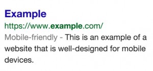 earch results. So the easiest thing to do to ensure that your website is indeed ready for Mobilegeddon 2016 is to search for this label. When using a mobile device, check if you can see the label under the URL. You can also use mobile-friendly testing tools which are available online to help you do this or talk to a reputable web design company in Fort Lauderdale, like Icon Website Design.
 - You have text that is readable without having to zoom in to get a clear reading.
- Links are placed at enough of a distance from each other so that there is no mix-up when tapping a particular link.
- You are not using a software like Adobe Flash.
- Content is sized to the screen so that there is no need to scroll in a horizontal angle or zoom in order to read the text.
- Review Google’s mobile-friendly guidelines and ensure that your website design checks with a majority of the outlined requirements.
- Use third-party tools to ensure that your website is mobile friendly. There are a lot of plugins, extensions, and components that work with third-party elements such as social media tools or shopping tools, etc.
If all factors are covered on your website design, you can be sure that Google will index it as mobile friendly. If it isn’t, then you need to have it done in-house or contact a Fort Lauderdale web design group. Icon Website Design can make it mobile friendly for you. Once you get it updated, within 72 hours the website design will register as mobile friendly and be indexed by Google as such.
Don’t Assume Your Desktop Rankings Will Transfer to Mobile Searches
 Please remember that this will only be applicable for your mobile search results and will not affect search results from a desktop, laptop, or tablet. Smartphone users are the only ones who are the target audience of this mobile-friendly strategy by Google. This means that even if your search engine results are at the top of the list in desktop searches, you can still be down in the listings if your site is not mobile-friendly. So it is always better to not take things for granted and just assume that your site is good to go.
The smartphone user has been shown to be more active and more likely to buy things online than users on desktops and other devices. Therefore, it is the wise business owners who want their companies to get the best results in search engine rankings that need to ensure their website design does well in Fort Lauderdale, drives traffic to their site, and makes them happy!